Follow us on social media today!
Interview with Mark Cutler and Nichole Schulze
Photography by Brandon McGanty
Tell us about this French farmhouse. How did you construct the house to reflect this style?
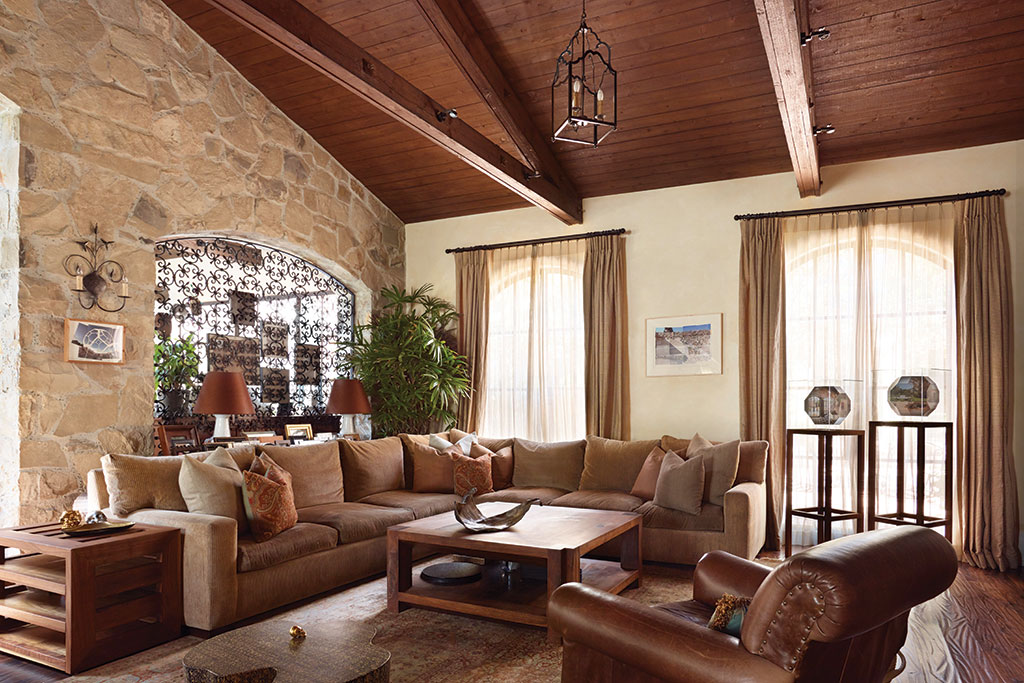
Mark: The clients had been to France and fell in love with it. So we worked closely with architect John Reed to evoke the feel of a house from the South of France without being so overdone that it looked like a pastiche, or imitation. To achieve that, we utilized modern elements and contrasted them with stone walls and distressed wood to help create a home that was European inspired but didn’t feel out of place in Southern California.

How did you approach the design of this project?
Nichole: Designing such a large space is always a challenge. We’ll often break such spaces down into smaller segments so that each one informs the next. Pattern, repetition, and symmetry really helped with this project. The architecture was so strong, we couldn’t fight it. There are, of course, little quirks here and there to make sure the design doesn’t get too serious, but, in general, we couldn’t have elements in discord with each other.
Mark: Creating a home like this is like writing a novel—you want to have pieces that are emotional hooks to either a specific place or a feeling. It makes the space richer and gives it a sense of place. For instance, the black-and-white-patterned floor in the foyer was inspired by an old bank in San Francisco the clients had visited.
How did you decide on the furnishings and colors for the primary bedroom?
Mark: We did a buying trip to France and brought back a lot of the antique pieces in the bedroom. Having elements like that can really help build meaning into the design. Other pieces, such as the bedside tables, came from their former home; we refinished and upholstered the panels to transform them into something that would work in the new space.
Nichole: We kept the color palette deliberately soft and quiet so as not to compete with the prominently beamed ceiling. Accenting with dark woods also tied the room together.
The office is such a warm and richly textured space. What was your goal for this room?
Mark: We wanted to evoke a European-style library with tall ceilings and deep-toned wood. The goal was to make it feel like an old space that had a young family living in it. We chose an art deco desk and a contemporary rug so the furniture felt like a mismatched collection that had grown over time. That sort of loose arrangement can make a space feel timeless since it’s not locked into a particular era or style.

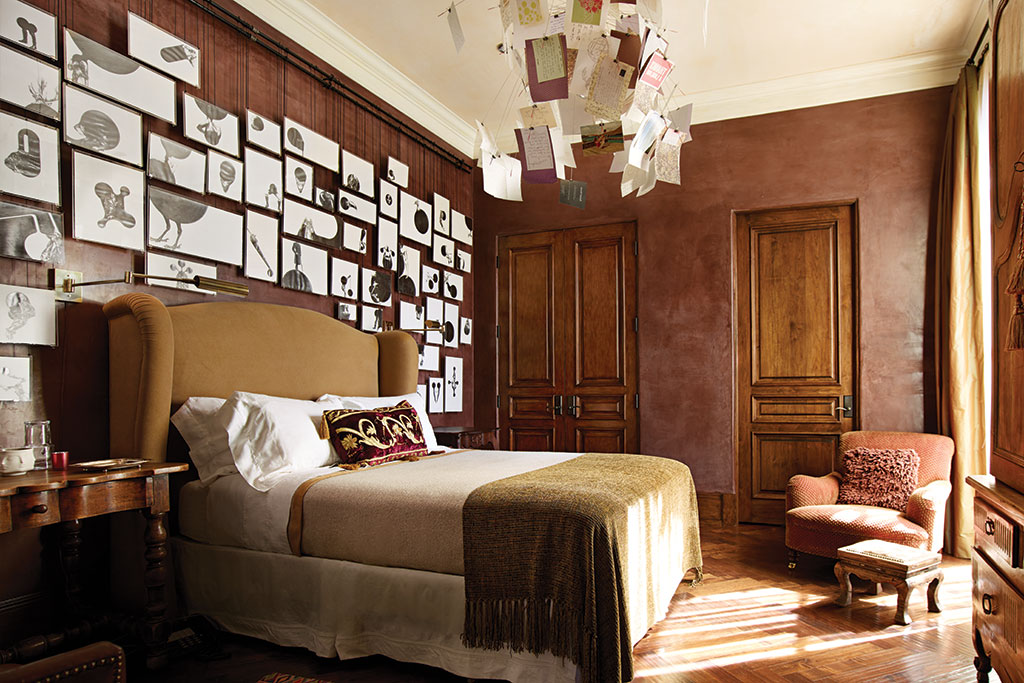
Would you discuss the eclectic art in the guest bedroom?
Mark: The walls are colored plaster. It gives the home such an immediate, grounded feel, as though it had been there and lived in from the get-go. The artwork on the mobile is a series of postcards written by guests who had stayed with the homeowners. It’s a lovely feature that tells the story of their friends and family. A local artist who’s also a family friend created the art on the wall specifically for that room.
What is the through line in the house that keeps it cohesive?
Mark: The hardest part of this project was the idea that we were creating the “feeling” of France and not an imitation of it—it would have been easy to get a bunch of design images and simply copy the details. Instead, we spent a lot of time analyzing images and spaces, trying to work out how they made us feel and how we could translate that into a new home in Los Angeles.
Nichole: To that end, French style runs throughout the house, from the antiques we bought in Paris to the re-creations that were made here; each piece in the home was selected because it helped to tell the story of the family that lives there. Henry David Thoreau once wrote about going confidently in the direction of your dreams and living the life you imagined. This house embodies that idea of making a dream a physical reality.
For more info, visit cutlerschulze.com
223 Views