Interview with Duväl Reynolds
Photos courtesy of Rustic White Photography
Interior designer DuVäl Reynolds explains how The Neverending Story, Harry Potter, and Sherlock Holmes inspired a uniquely creative yet highly balanced room.
How did your design journey begin?
I actually went to college for neurology but left school and worked in New York for a bit before moving to the DC area. I got a job at the design firm California Closets, where I discovered that I had much more of a knack and passion for design than I had realized. So I went back to school full-time at night to get my bachelor’s degree in interior design. I opened my own firm in 2017.

How did the Introvert’s Quarters project come about? Are you an introvert?
I worked on this project for House Beautiful magazine, who asked me to design a room in an 11,000-square-foot place for their annual Whole Home project. It was the first real show house I had ever done; between that and the fact that Whole Home is very well-known in my industry, I felt overwhelmed and was buckling a bit. I called the market director to discuss it, and she simply asked, “If this was your house, what would you do with the room?” That provided the mental and creative freedom I needed.
And, yes, I am an introvert. People can’t tell because I don’t come off as one: I seem very social and personable. But I need a lot of recharge time by myself, and I would love a room like the Introvert’s Quarters, where I could disappear and feel like I was somewhere else. But I didn’t want the project to seem time-stamped into an era. I needed it to feel almost fantastical yet also grounded in practicality, so there’s a daybed, a sitting area, a desk, and a reading corner for enjoying books.
What purpose did you design it to serve? Should it be used as a spare room or a study, perhaps?
It could function as either—it could even be a guest room because of its size and features. The room itself is about 18 feet by 18 feet, and the daybed is around 54 inches wide, almost the size of a queen bed. In addition, the space has a walk-in closet, which is made for a man but also has feminine touches such as pink paint, and a dark-blue bathroom covered with moldings and millwork.

The wallpaper is quite eye-catching. Tell us about it:
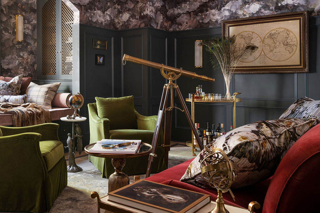
The wallpaper was the first thing I obsessed over for this project. The one I chose is very dramatic, playful, and imaginative, setting the tone for the space. My goal was to encase the room with this beautifully imaginative aesthetic without it being overwhelming or too much of a focal point. To that end, I only put it on parts of the wall and ceiling while simultaneously adding millwork to the base, which I went heavy with to ensure that it would hold its own. Overall, everything in the room does: the chairs, the sitting area, the closet, and so on.
What drew you to that specific wallpaper?
Unbeknownst to most people, I am very much emo—the type of person who will sit in the rain and cry to myself. I don’t know why, but in my head, I’ve always felt like the kid who has no friends and is an outcast, even though in high school I was voted most popular and was homecoming king. That wallpaper made me feel like Bastian in The Neverending Story, as if, through it, I could escape reality.
What was your inspiration for the unique bookcase?
I’m a huge fan of Harry Potter and of the fantastical world in general. By incorporating millwork and custom metal framing and wiring into the bookcase, I made it almost match the style of the library you see in those movies. I also designed it so there’s a dichotomy of elements playing against each other; its doors show a sense of captivity that grounds you, but the books provide your escape.

You’ve described this room’s overall style as a combination of dark academia and grandmillennial. Would you elaborate?
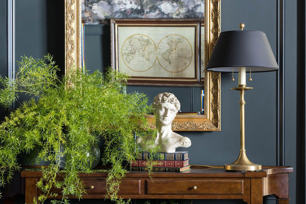
Certainly. Dark academia is like Harry Potter’s Hogwarts or Sherlock Holmes’s Diogenes Club, a place where he and his brother would honor and respect knowledge by thinking in quiet. I can relate to that, which is why I mixed in details like a bust, telescope, and magnifying glass. Grandmillennial, also called granny chic, is an aesthetic that elicits a sense of nostalgia. By blending the two in this room, I wanted to balance two very different things: the imaginative pursuit of exploration and learning and the grounding comfort of grandma’s house.
Being red and green, the furniture also stands out. Is that a nod to the holidays?
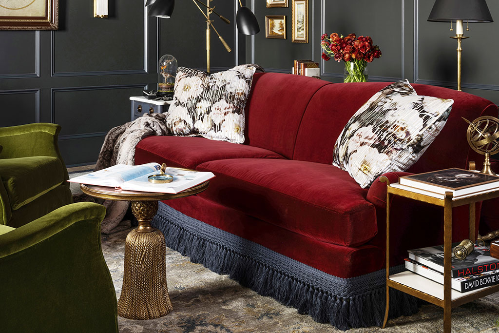
One hundred percent. Those colors remind me of Christmas, which I love—in fact, my wife and I keep our tree up for months after the holidays. So even though the room is dark, there’s a certain touch of Christmas festivity and happiness. The holidays still evoke that for me, and I wanted it to be reflected in this project.
For more info, visit duvalreynolds.com
19 Views