Interview with Melissa Fields
Photography by Mallory Hewitt
Military veteran-turned-interior designer Melissa Fields explains how her Air Force experience benefits her clients and discusses a project in St. Hedwig, Texas.
Tell us about your military career:
I served in the Air Force for twenty years, starting as a medic and then becoming a warranted contracting officer when deployed to the Middle East. Later, I got my MBA in acquisition and contract management and, when stationed at the Air Force Academy, was tabbed as the speechwriter and deputy staff director for Lieutenant General Michelle Johnson, the first woman to lead a service academy. Eventually, I became the chief of contracting inspections for the Air Education and Command inspector general and was traveling every month.
By that time, though, I was a wife and mom, and having a military career was putting a huge strain on my family. I would never get too comfortable at home because I might have to leave again in an instant. So I decided to retire as a major at the start of 2018.

Was your transition to interior design a smooth one?
I had been talking to my husband about doing design well before my retirement. Whenever we would travel, I’d be fascinated by how the hotel lobbies and rooms were laid out, and I’d soak in the design and decor of model homes whenever I could. I’ve also designed every house we lived in; it always felt effortless to me, and I absolutely loved it.
So in 2016, I founded Shades of Gray Design. It was a home staging and redesign company at first, but after a year, I knew I wanted to create spaces for homeowners who would stay in their homes, enjoy them, and get a return on their investments.
How did your firm’s name come about?
It was my husband’s idea. At first, I thought he was joking. He hates the Fifty Shades of Grey movies, and that’s what people would immediately think of. Also, I didn’t want people to get the wrong impression. [Laughs] But I was sold on his reasoning. The color has so many different shades—subtle and light, dark and moody, and everything in between—and it provides a great backdrop for any style. Like the many shades of gray, there are many different design styles.
You call your design approach “military inspired.” Would you elaborate?
My experience gives me a somewhat unique take on design. In the military, details can be a matter of life or death, so I am extremely organized and detail oriented. I also have a ton of project-management experience and worked with many different personalities in my military career, making it easy for me to juggle my clients’ various needs for their homes.

How would you describe your design style?
I lean more toward modern and contemporary vibes, but I don’t force either on my clients. It’s their money and their home, so their preferences matter most, though I encourage them to keep an open mind. I like to say, “Let us show you what’s possible” because it’s truly a collaboration.
Your website emphasizes your credentials and has up-front pricing. Is authenticity a big part of your business?
Yes. I love transparency—it allows people to know who I am and what they can expect if they work with me. I debated up-front pricing for a few years but ultimately found that when I didn’t have it, I got more calls yet fewer follow-ups after discussing the cost. It’s a way to weed out those who are not my ideal clients.
I also like to be honest about how I work. If you’re calling me to mimic a picture from Pinterest, I’m not your designer because I don’t want to copy what somebody else has done. Your design should reflect you. If you’re interested in that, then we can talk. I’ve had so many people tell me that I’m the exact same in person as I am on Instagram; it’s almost like they already know me. That means everything.
How do you determine your color choices?
Number one is the feeling the client wants evoked in the space—for a bright, open, and airy room, I won’t consider darker colors. Second is how the client plans to use it. For example, if we’re working on a creative area, I’ll want the design to inspire them and get their ideas flowing, so I might suggest bold colors that make them feel happy or a fun pattern that sparks joy. I’ll also have a baseline and ask them to show me their inspiration. All those considerations help me put the color scheme together.
Tell us how the St. Hedwig project came about:
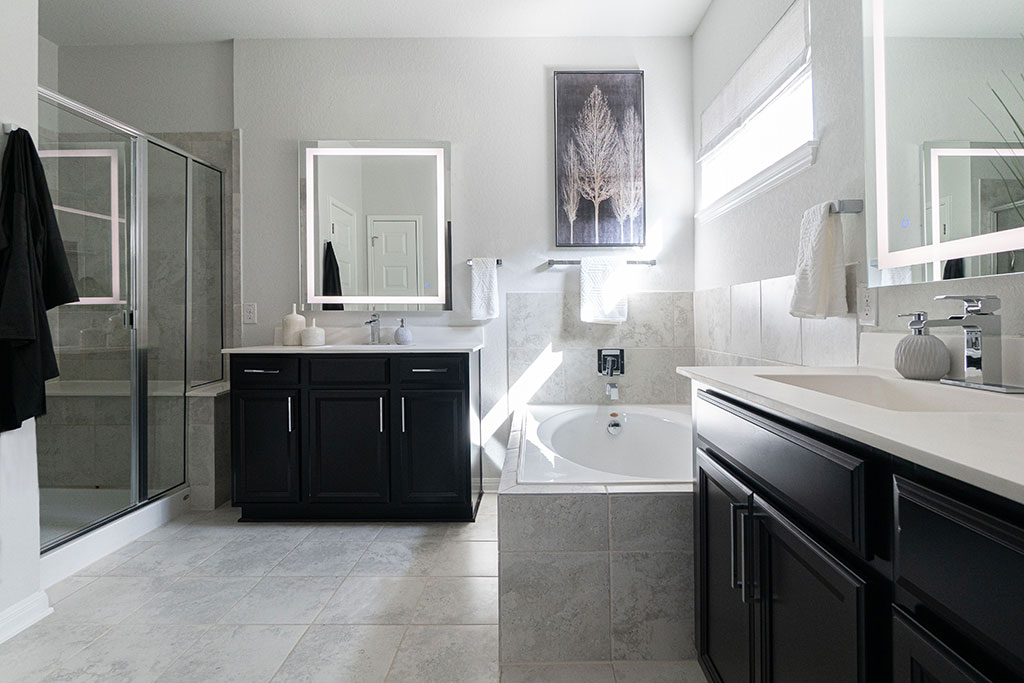
We did the living room first, and a year later, the client asked us to update her master bedroom and bathroom. She didn’t want to do a complete bathroom remodel, so we did some small updates, such as replacing the builder-grade fixtures. These changes really made a huge difference in that space, which was originally very vanilla.

Did your client want you to continue the style of the living room design in the bedroom and bathroom?
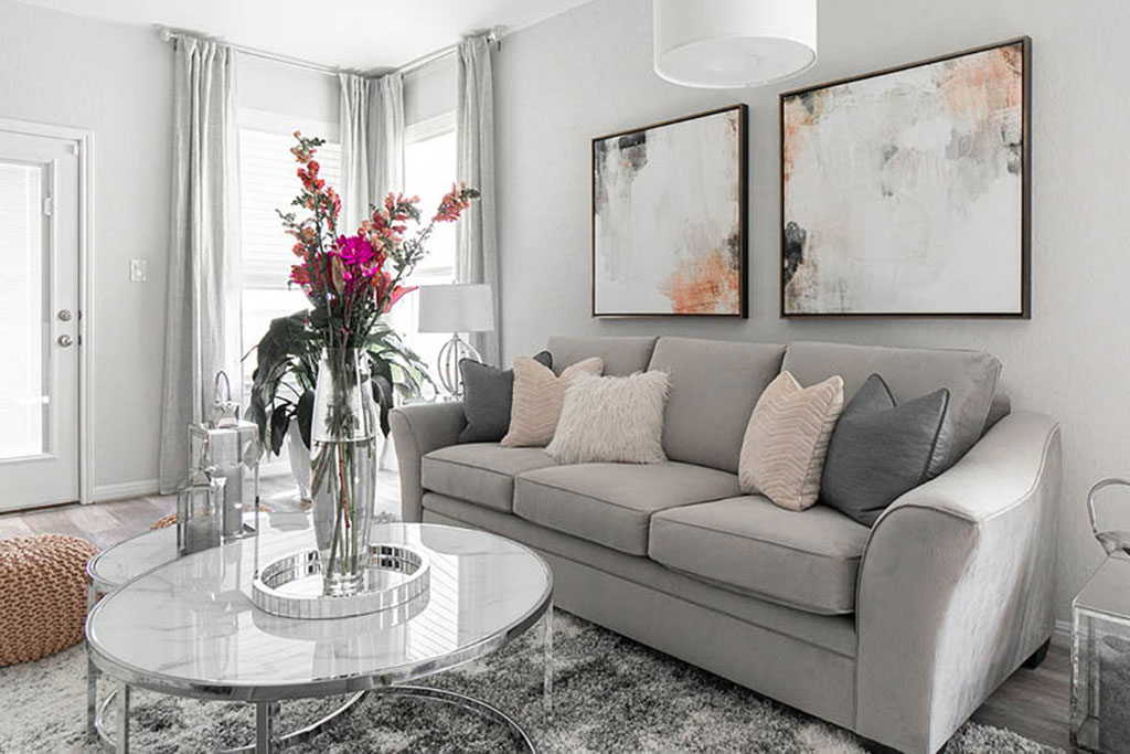
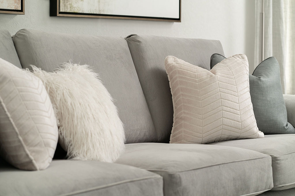
In her living room, we barely changed the colors—she preferred adding touches of blush, gray, and beige. This extended to the contemporary decor and furniture we added like the chic round nesting tables and plush shag rug.
When she was ready to update her bedroom, she initially wanted the same scheme. Instead, I created two mood boards: one that was very similar to her living room and another that was bold with darker, moody colors. When I showed them to her, she immediately pointed to the dark one and said, “That’s what I want.” She explained that it looked very high-end, like a luxurious hotel, and had a glam vibe.
The bedroom and bathroom seem to complement each other. Tell us about that design decision:
In her bedroom, we went dark with the walls, trim, and doors, added a fireplace, and kept her bed and window coverings light. However, she already had dark cabinetry in the bathroom, so it would have ended up very cave-like if we had carried the bedroom scheme into that space. Instead, we flipped it, keeping the walls and flooring light by retaining the original color.
How did you incorporate the fan in the living room and the fireplace in the bedroom into the respective designs?
She wanted to keep a fan in her living room, so my first dilemma was how could we glam it up within the functionality of the space. I found this cool fan with a little crystal chandelier, which was eye-catching but not over the top. For her drapery hardware, we went with finials that were crystal-like to match the chandelier. Keeping her drapery light, having a nice cordless Roman shade, and layering it with floor-length curtain panels created a luxe feel.
The fireplace is mostly for ambience. That said, we do sometimes experience cold nights in Texas, so it’s nice to have a little heat and coziness. She spent good money on that room: her bed and drapery rods were custom-made, and the accent wood paneling was very specific. All that gave her exactly what she wanted—something very unexpected.
For more info, visit shadesofgraydesign.com