Interview with Lina Galvão and Erin Coren
Photography by Jacob Snavely
Family-focused design is front and center at Curated Nest, a full-service firm serving Connecticut and New York.
Here its founders, Lina Galvão and Erin Coren, reveal how they renovated a Larchmont, New York, colonial home with fun and function in mind.

How did you discover your passion for interior design?
Erin: It’s definitely been a lifelong passion for me. I remember when I was six, my mom would yell at me for rearranging all the furniture in my bedroom over and over. There was never any doubt about what I would do growing up. I went to school for interior design, trained under talented designers in Atlanta, and moved to New York City to start my own company.
Lina: Interior design is a second career for me after doing management consulting for about ten years. I felt a huge pull toward the creative arts, so I took a leap of faith and returned to school for interior design. I never looked back—I love the marriage of problem-solving and creativity inherent to design. I met Erin in Brooklyn shortly after we both became moms for the first time, and we instantly hit it off. Combining her extensive experience and my business background, we started Curated Nest together as a new venture.
What is your design philosophy, and how does it inform your client relationships?
Lina: Our specialty is livable luxury, with a focus on creating homes that deliver comfort, well-being, and, most importantly, a high degree of functionality to support modern families with busy lives. This philosophy has resonated beautifully with our clients. In fact, most people contact us because of it. Today’s families want custom solutions that serve their unique needs, so we hammer home our mission in all points of the client relationship, from conception to installation.

You designed the Larchmont Colonial home for a family. What were their goals for the project?
Erin: This early 1900s home is in a charming area of downtown Larchmont with many other historic homes. It has three bedrooms, three and a half bathrooms, and three floors, including a spacious finished attic, but its layout was choppy due to previous remodels and the center hall structure typical of colonials. The kitchen lacked counter space, storage, and natural light. However, the living and dining rooms had ample space. Overall, the home’s history gave it a lot of character.
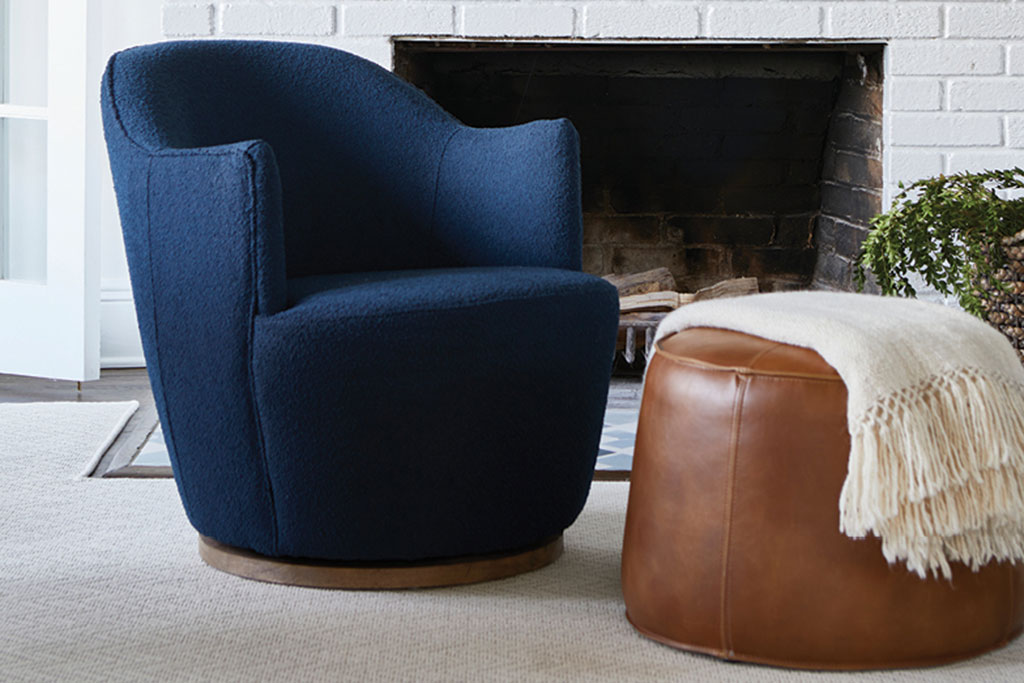
Lina: The client wanted a better, more open layout to suit their needs of raising energetic kids and entertaining frequently. Aesthetically, the husband loves leather, midcentury furniture, and bold colors while the wife prefers modern designs in light, airy neutral colors with copper- and rust-toned finishes, so we had to find a way to marry their two styles together.
There’s a unifying element to each room in this project. What is your secret for achieving this without it feeling overly repetitive?
Lina: We like to repeat certain elements in our palette of materials, such as light oaks, brass-and-gold metals, rust-and-blue tones, and black accents. This creates a lovely rhythm and cohesion throughout a home. The secret to doing it right is using these colors and materials in different ways with a supporting background of various complementary neutrals. We used blue, for example, in the beautiful grass cloth wallpaper in the dining room, which offers an organic, and soothing texture. In the same sight line, looking into the kitchen, you can see the range hood is also blue but in a bolder solid tone and, of course, a totally different texture. This keeps the repetition from being boring.
How did you go about selecting the perfect lighting for each space?
Erin: Lighting is critical because it provides so much bang for your design buck, and it can do many things: create a mood, add an interesting sculptural element that “floats” in the air or on the wall like art, and serve as the jewelry of the space, like the accessory to the perfect outfit. We love using it to make a statement, as we did in the dining room, where the geometry of the chandelier is striking against the soft lines of the table and wallpaper. It activates the space, drawing you in with how unexpected yet complementary it feels. In the bedroom, an intentionally relaxing room, we chose a more toned-down light fixture with soft curves.

The framed shower in the main bath gives the room such a stylized look. Do you think people are moving toward more unique and bold bathroom designs?
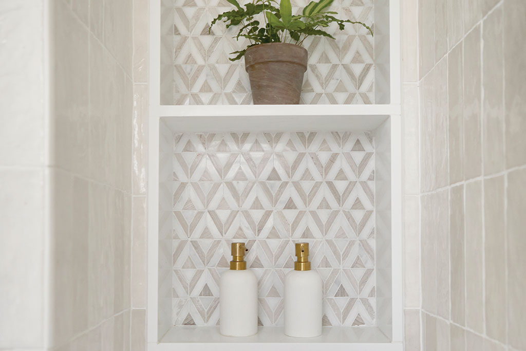
Lina: Absolutely. Shower enclosures are a major area where designers have gotten creative, and we’ve seen a lot of frames like this one in multiple configurations and styles, some even arched. One look we also love is floating vanities made of stone, which is a great way to incorporate natural textures. We made this primary bath unique to our client by creating a custom walnut vanity to tie in the desert tones in the bedroom, and we used the triangle tile to reflect the couple’s personality—not too serious, whimsical, and full of energy.
The children’s elements seem to blend seamlessly with the rest of the home’s design. How did you achieve this?
Erin: That’s kind of our thing! Our goal is to create homes that really work for families, not the other way around. We added several clever storage solutions to handle clutter and toys in almost every room. We also created a dedicated playroom on the first floor, which is ideal for keeping larger and messier toys contained. The kids’ furniture blends with the rest of the home’s aesthetic and has a touch of midcentury modern with light-oak wood and tones of dark blue. When everything has its place for the adults and kiddos alike, we find that our clients use the functionality they have.

How do your personalities combine in your designs?
Lina: I like designing spaces that feel comfortable and easy to live in, like when you’re in a five-star spa and everything is provided for. When designing a kitchen for a family of five, for example, the drawer, cabinet, and appliance layout should keep the kids in mind. We love including a beverage center for kids’ snacks and drinks so they can access them easily without a parent. It’s about function without the fuss.
Erin: Travel serves as a huge source of inspiration to me. I love experiencing other cultures, architecture, art, and nature. I just took a hiking trip to the Azores and experienced wildly different terrains that were so dramatic and breathtaking. I bring these adventures back with me and translate them into color palettes, shapes, and patterns in our designs. I’ve always been attracted to Moroccan motifs and am hoping to travel to Morocco in the near future.
What is your favorite design trend of the last few years? Which new design trend are you most excited about?
Erin: We’ve been loving the use of bold stone in kitchens, baths, and other spaces. Similar to the resurgence of wallpaper we saw in the last decade, stone adds color and visual texture and is timeless. If that price point is inaccessible, porcelain has come a long way in replicating the look of natural stone. We’re seeing this trend continue in smaller pops with the use of exotic stone and bold marble as accents on furniture and lighting—we can’t wait to see how this trend develops!
For more info, visit curatednest.com