Interview with Allison Hogue
Photography by Rafael Soldi
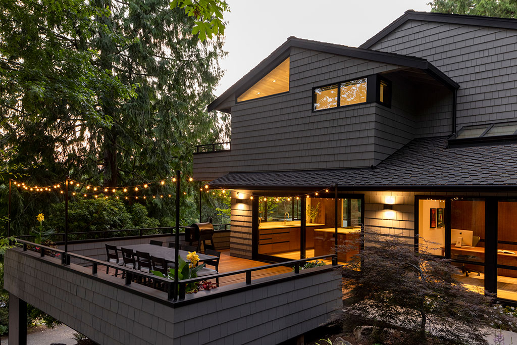
Allison Hogue, cofounder of Floisand Studio Architects, and her team created a cohesive and inviting living space for her clients that integrates a midcentury home with its surrounding environment in Mercer Island, Washington.
Tell us about Floisand Studio Architects:
My partner, Richard Floisand, and I founded our company in 1999 as a full-service architecture and design practice. Since then, we have been crafting residential and commercial projects at all scales around the Pacific Northwest. Now a team of five, we are driven by a shared passion for creating architecture that transcends any single aesthetic. Our approach is centered on crafting sustainable and culturally sensitive solutions that appeal to modernists and traditionalists alike.

Which projects do you enjoy most?
I’m drawn to collaborative projects where there is great communication, innovative thought, and mutual trust between me and my clients. I love working with forward-thinking clients who are open to creative solutions and willing to take risks to make something truly special.
What drew the owners to their house on Mercer Island?
Our clients, who purchased the home in 2010, were attracted to the quiet neighborhood, the home’s midcentury feel and large, west-facing windows, and the surrounding landscape of cedar, maple, and pine trees.
Who originally designed the house?
Renowned local developer Black and Caldwell built the home in the 1970s and remodeled it several times prior to our clients purchasing it. They understand that the house was designed by Ralph D. Anderson, a prolific twentieth-century architect and preservationist from Seattle.
What were some of the owners’ gripes about the house?
Despite the home’s ample size, our clients rarely used the dining room, living room, and main entry. They mainly spent daylight hours in the combination kitchen/family room in the southern third of the main floor because it received the most light. They didn’t need more space, just a more efficient layout.
Also, you couldn’t find the main entry from the street because it was, and still is, tucked along the side yard near the main stairs—one of the home’s farthest points from the street. Guests would mistake the kitchen side doors for the front entry, which the kids used as a primary point of access. And because there was no closet or mudroom nearby, stuff was forever accumulating in the middle of the kitchen—an annoyance to our clients. It was less than ideal.
Another frustration was that in the ‘90s, a previous owner had filled in what appears to have been a covered porch and plopped a small primary bath addition overtop. Despite its south-facing orientation, the room was dark and not very inviting. Additionally, it sat awkwardly on the corner of the low roof right at the nexus of a cantilevered upper-level porch that may or may not have been original to the home.

How does the new plan solve these problems?
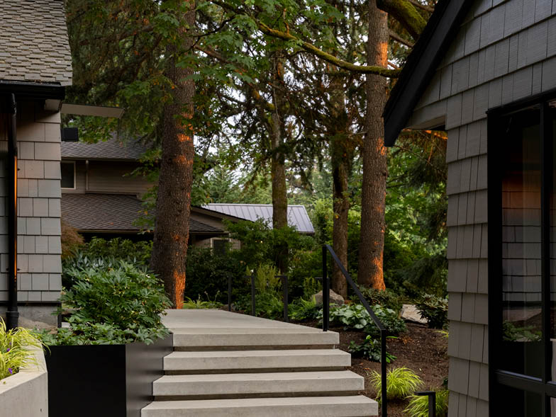
Starting at the entry, new hardscaping, steel planters, and angled landscape walls now guide guests through the tree-filled property to where the new raised concrete porch marks the formerly hard-to-find entrance. A steel-and-wood canopy houses lighting that illuminates the front door and serves as protection from the rain. Intentionally placed landscaping areas buffer the home and offer privacy to the indoor spaces.
Inside, the main floor was gutted and remodeled to create more functional space for the clients’ family of four. The underused living room was restructured to better connect to the dining room and kitchen, and the unnecessary family room was reimagined into a much-needed home office and larger kitchen. The walls that separated the dining room and kitchen were removed, while the entry foyer, powder room, and closets were relocated and reconfigured to maximize flow and reorient the living spaces toward the outdoors. New windows and sliding doors also connect the inside and outside spaces and lead out onto the refreshed decks.
Did any obstacles cause you to tweak the plan?
There was, and is, an HVAC duct chase that runs from the mechanical room in the basement to the upper floor. This chase sits near the entry and could not be moved. It turned out to be quite the puzzle piece.
The budget was also a challenge; it took larger-scale changes to the building shape and layout off the table. With the home perched on a steep slope surrounded by established trees, rebuilding would have been costly and fraught with site-development issues. To stay within their budget, our clients settled on keeping the building footprint, roof shape, and framing as is.

What other original parts of the house were left?
We preserved the lower-level walk-out basement, the home’s cantilevered central-stair structure, and its exterior shell. Otherwise, the exterior walls of the main and upper floors were stripped down to the wood studs, the interior walls were removed, the interior spaces were rearranged, and the windows and doors were relocated.
Perhaps one of the most recognizable details of the original 1970s design is the “pork chop” roof eave. Aesthetically controversial, the pork chop is the result of connecting the end wall to the angle of the roof overhang. Many see the resulting jutting triangular shape as a home detail to be avoided at all costs. Since the clients didn’t really need more space—just better space—when we committed to keeping the building shell, we committed to keeping the original roofline and its pork chop eaves.
What design elements kept this house cohesive?
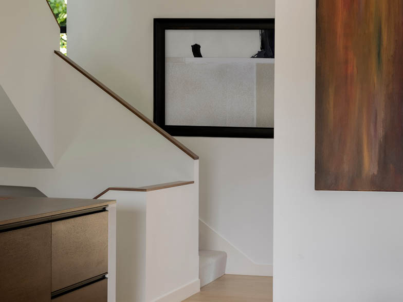
Consistent use of natural materials can be found throughout, including quartzite, white oak, and walnut, which are warm yet highly durable. The cabinets are detailed with blackened aluminum J-pulls to keep the casework hardware unobtrusive but easy to use.
What design decision made the biggest impact?
We enhanced the home’s indoor-outdoor connection by orienting the rooms to a specific exterior view, garden, or deck. For instance, we relocated the steps down into the living room so that the space could be furnished with a sofa that would face the fireplace, the TV, and the view all at once. The addition of new energy-efficient skylights, windows, and large sliding doors also maximizes the natural light.
What was your favorite part of working on this house?
I really enjoyed creating the architectural moments and details that tie the interior and exterior experiences together. I like to consider how people are drawn into a space and interact with it. Duality plays a substantial role in creating intriguing design, whether it’s hard and soft finishes, darks and lights, or filtered and direct light. All of these give us options for how to use a space. And by layering them in a thoughtfully considered way, they can make a space both intriguing and peaceful.
For more info, visit floisandstudio.com